The REITZ PROGRAMMING BOARD (RPB) is a student-run organization that engages the University of Florida's student body of over 50,000 students and Gainesville community with premier programs at the J. Wayne Reitz Union, the university's student union. It serves the student body in providing engaging free events on campus while catering to a wide range of interests for students to connect with each other. It unites students and reminds them of the supportive community surrounding them in Gainesville.
As RPB recently began focusing on programming rather than entertainment, the rebranding came about as a reintroduction of what RPB has become today. The original title, Reitz Union Board of Entertainment (RUB), did not dynamically encompass each department under the organization and limited it to a focus on entertainment. While maintaining the distinction of the RUB logo, RPB needed a logo that was memorable and created a clean, modern, and friendly atmosphere to students.
RPB Rebranding Motion Graphic
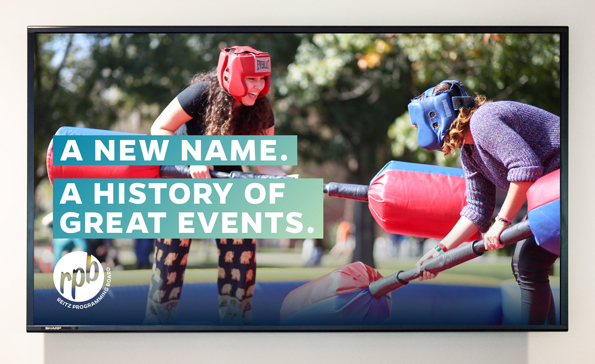
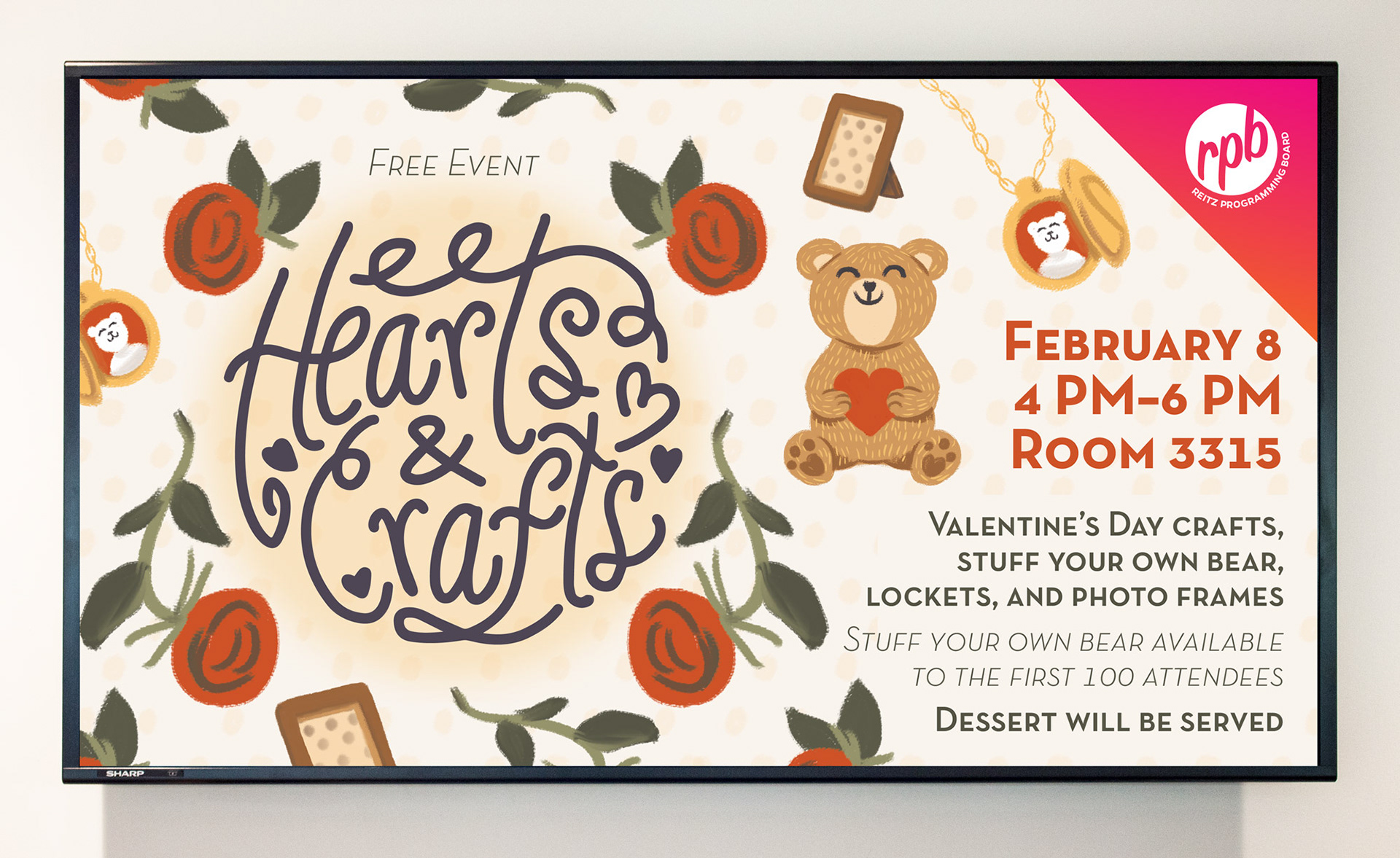
Relaunch Digital Display Component (Photo Credit to Thomas Moseley)
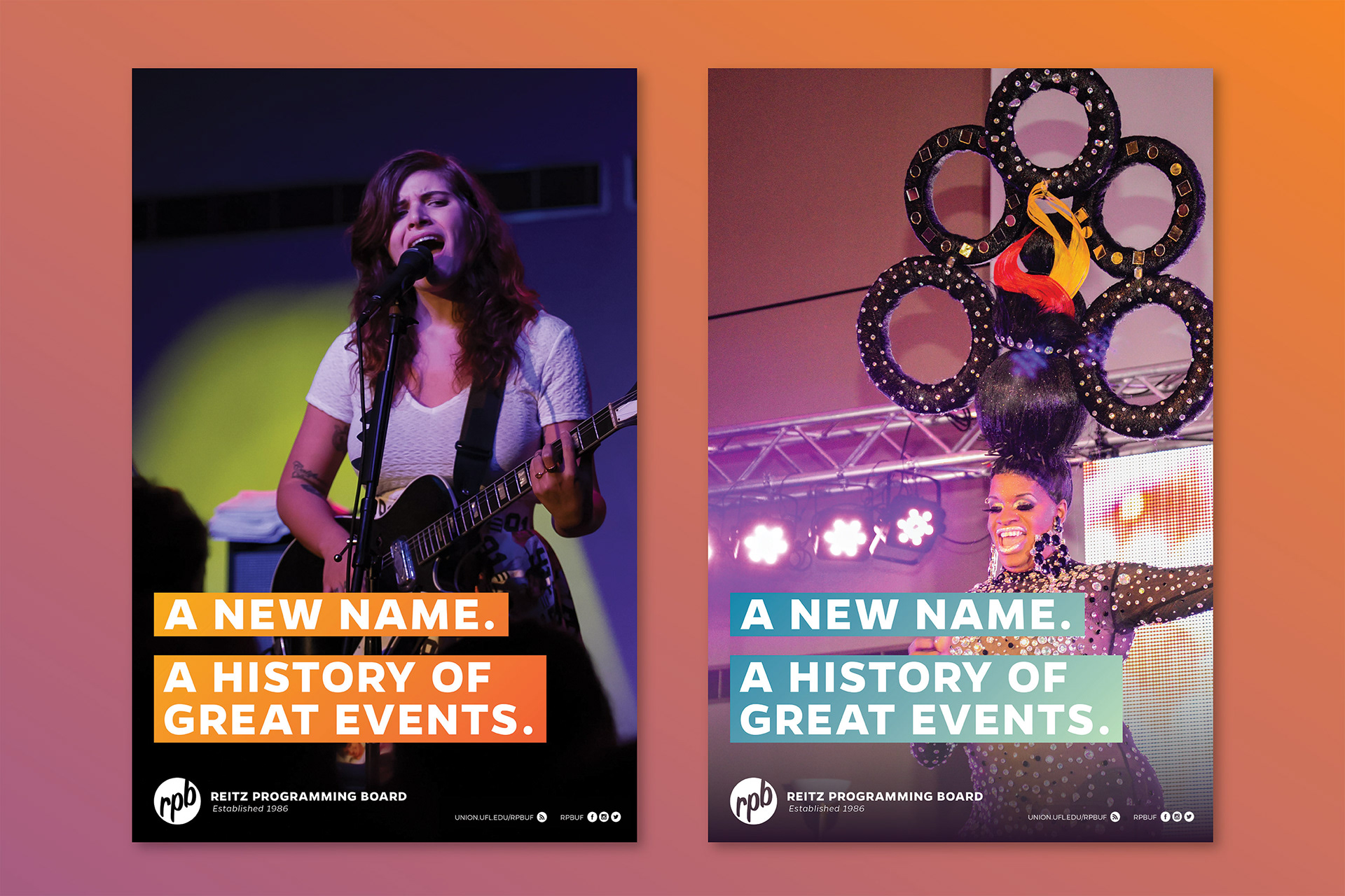
Relaunch Poster Component [Photo Credit to Sylva Kabuanseya (Left) and Carla Vianna (Right)]
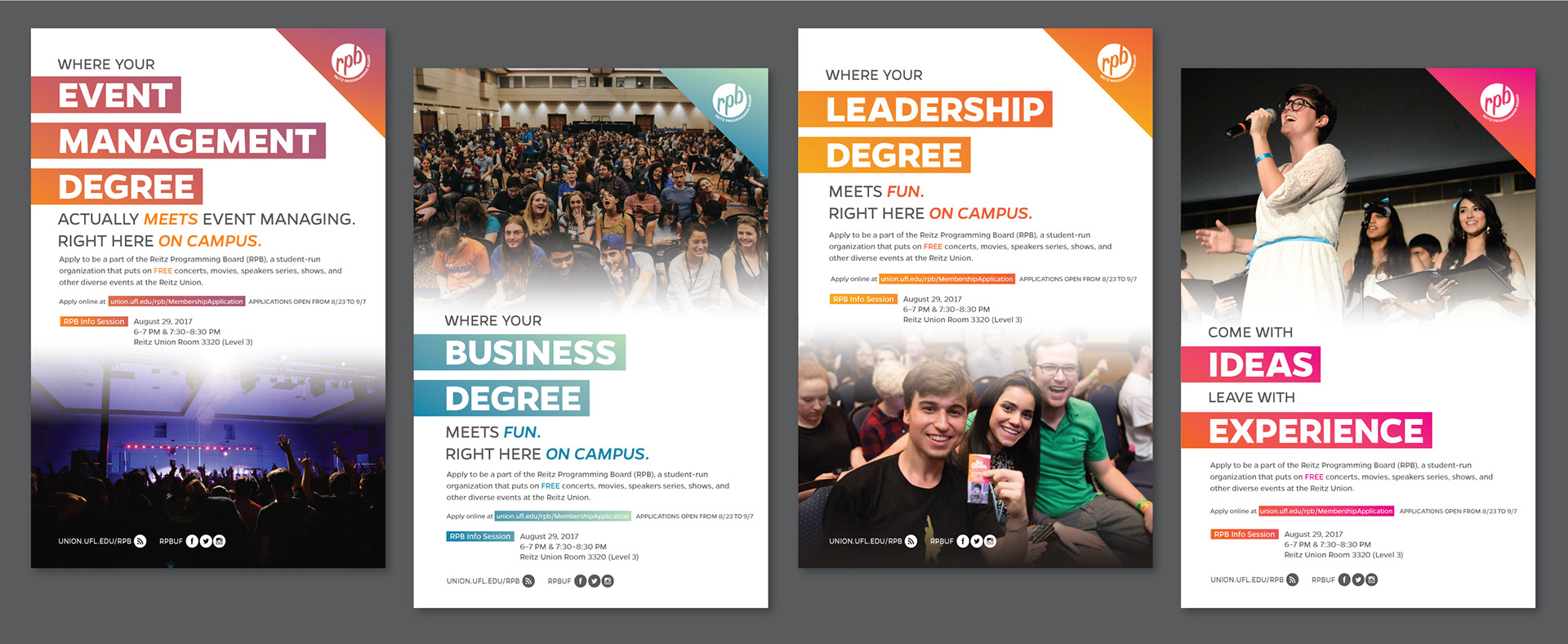
Recruitment Poster Component [Photo Credit to Thomas Moseley (First Three Photographs) and Carla Vianna (Rightmost Photograph)]
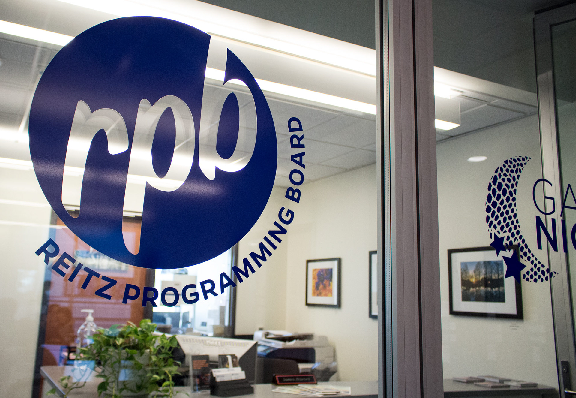
Office Vinyl Component

OBJECTIVE
The Reitz Union Board of Entertainment (RUB) transitioned to be named the REITZ PROGRAMMING BOARD (RPB) during the summer of 2017. I was challenged with rebranding this organization, starting with the development of a new logo.
After meeting with a board director of the organization, we clarified the purpose behind the RPB organization. The following statements defined at the meeting establish key points to keep in mind for the rebranding:
• Be relevant, distinguishable, memorable, and have personality in order for it to be accessible to students
• Be friendly, as the events create spaces for people to have fun and be comfortable
• Have a clean, simplified aesthetic
• Depict legitimacy and establishment as the organization has successfully existed for about 32 years
As the logo would be utilized in a variety of contexts, it is important that the final design be flexible with different iterations containing the organization title. Compared to the RUB branding, the rebranding would still employ gradient effects used in previous graphic material.

RESEARCH
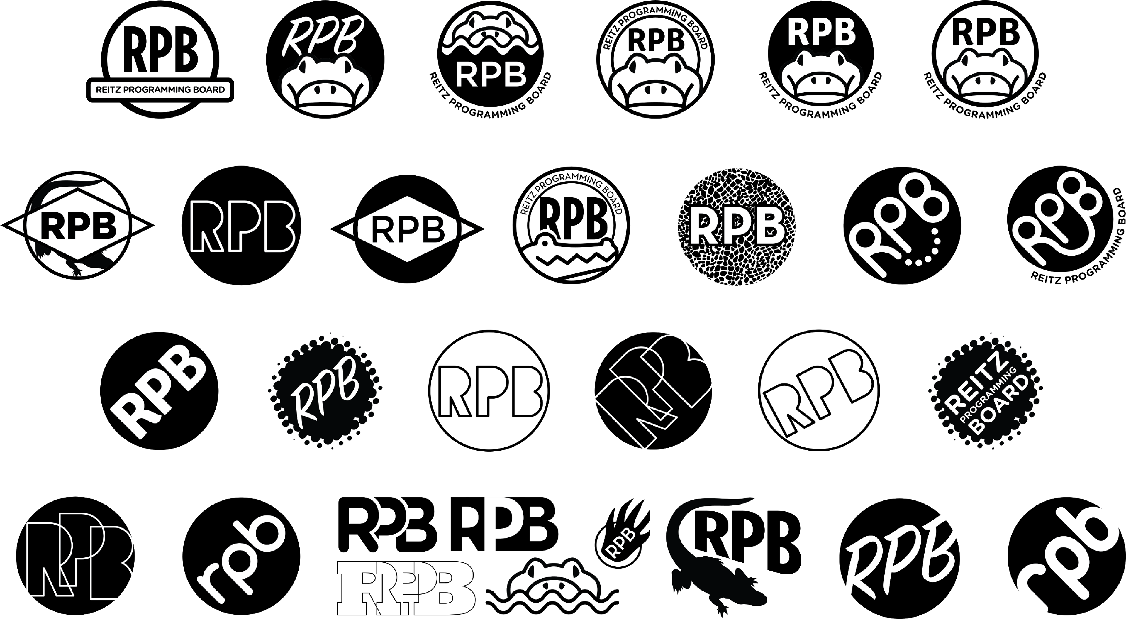
My research began with observing the logos of other university programming boards. I categorized these findings between logos that referenced the school mascot, campus architecture, a circular theme, abstract forms, imagery relevant to the organization, or was just a themed font consistent with the school branding. These forms were either separate, within, radiating from, or integrated with the organization name.
Student programming board logos that contain references to the school mascot or architecture seem to be more successful in creating a connection with the university. This relevant imagery creates an immediately recognizable connection with the school. With so many programming boards having the same initials, this element helps distinguish the organization from those of other universities. Those with circular themes create a professional appearance. Those with themed fonts are similar to the branding of their respective university. This creates greater similitude between the organization and school, thus stronger recognition as a university-sponsored group. The abstracted forms included in the some logos give the programming boards a strong visual identity. Its relevance to the university's branding depends on what elements they chose to represent the school, such as the color palette. Imagery within the logo relates the organization to the events hosted.
THESE GRAPHICS DO NOT BELONG TO ME. The imagery above has been used as a broad-level source of graphic inspiration for this rebranding only. All material created for RPB will be original in graphic design, subject material, and copywriting. These graphics are not to be shared or redistributed.

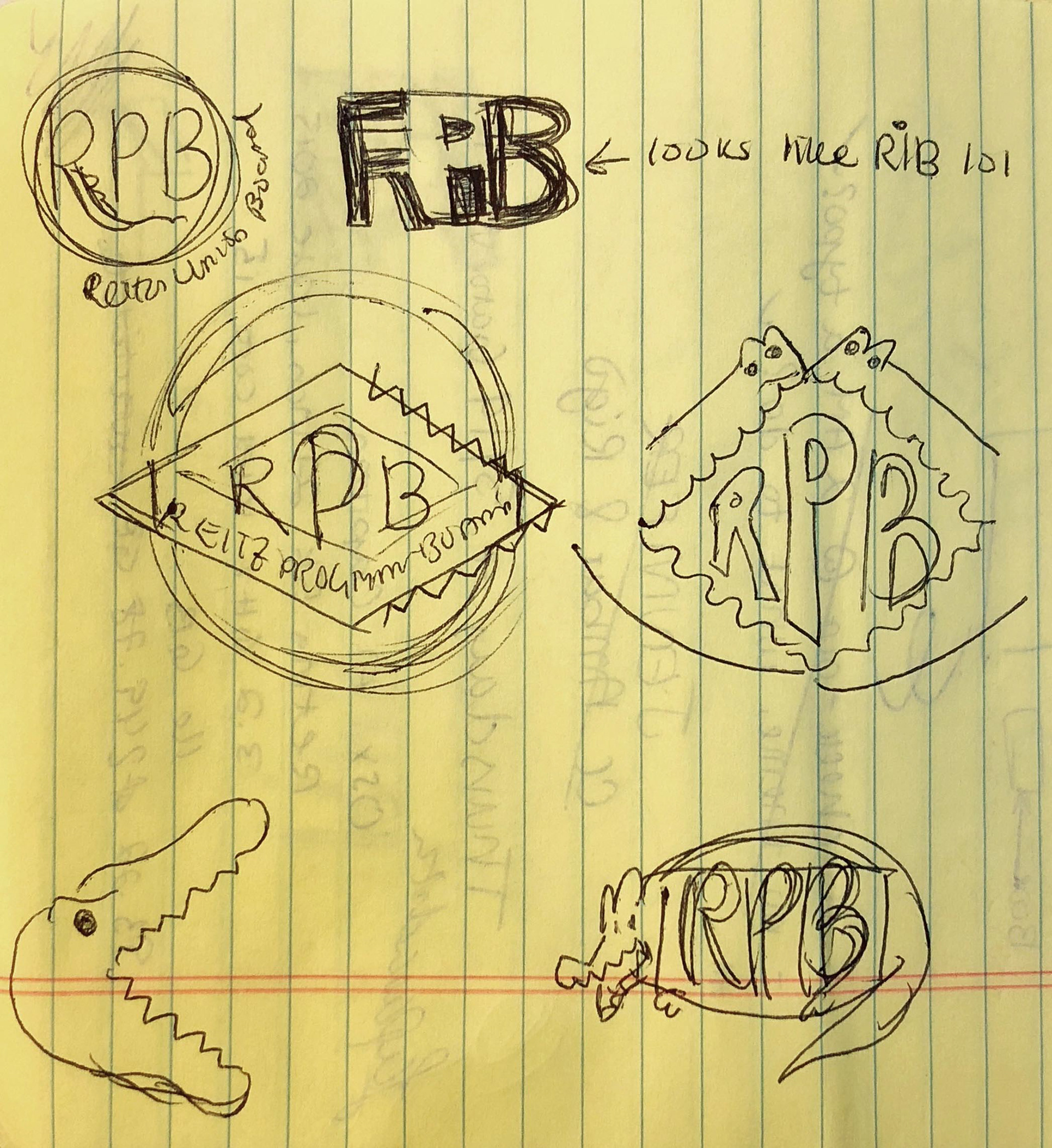
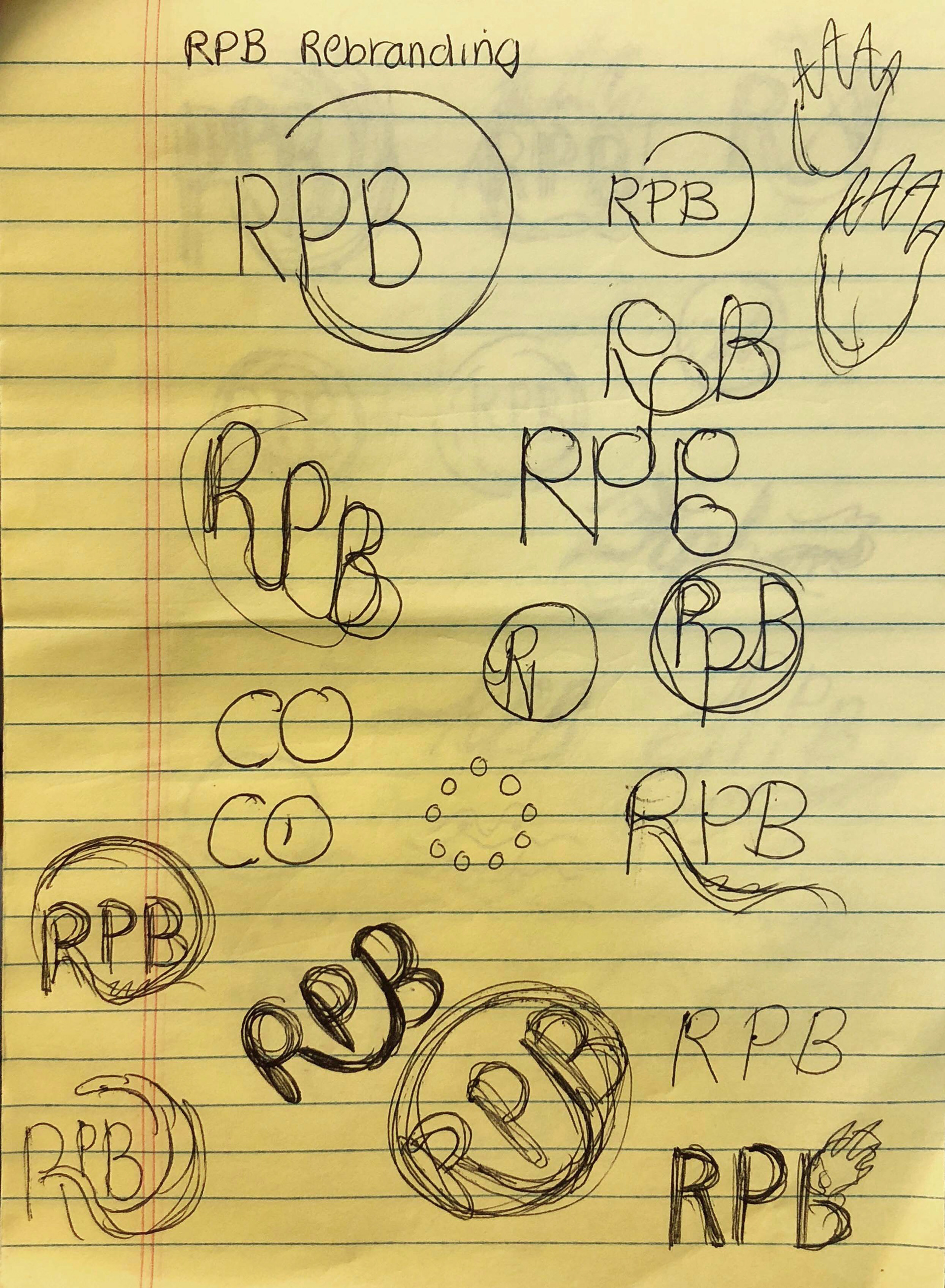
DRAFTING + REFINEMENT
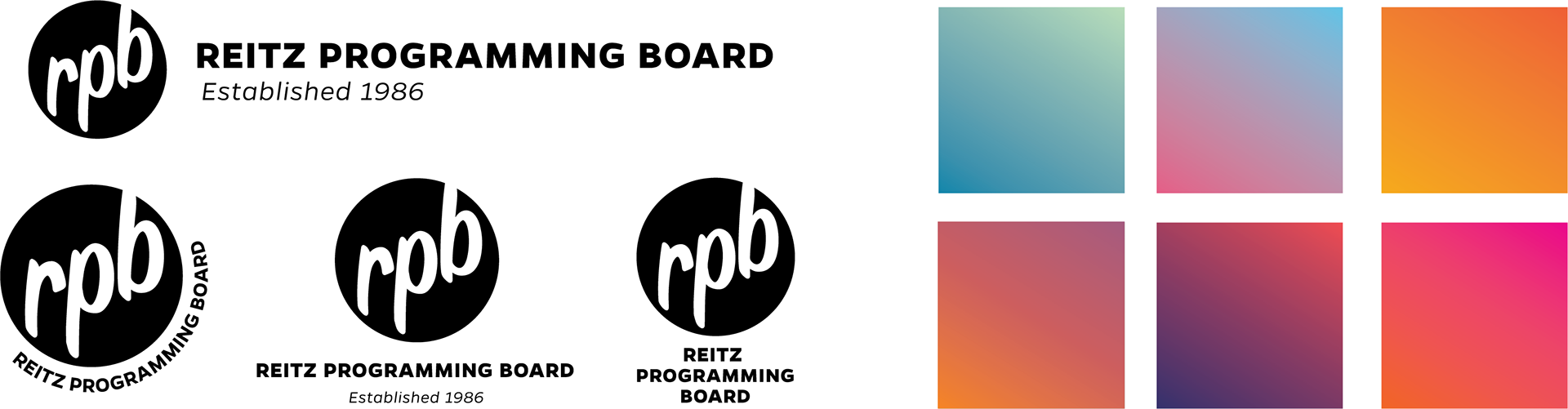
Ultimately, a circular letter mark was selected as the approach for the logo. A lowercase script font would be implemented as it is youthful and progressive. The text is at an upward angle towards the right—this gives a positive attitude to the logo, as though it is striving for greatness.
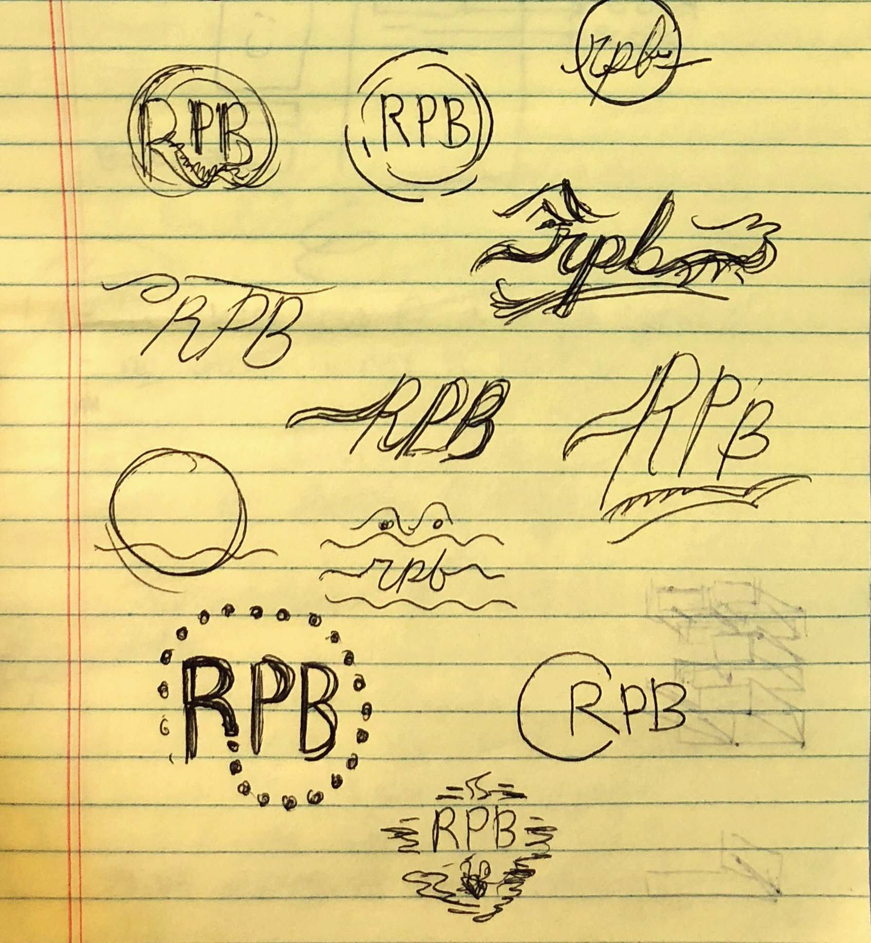

MILLENNIALS / CENTENNIALS AND CURSIVE
The durability and longevity of the new RPB logo was put into question when utilizing a script font. Various articles online have indicated that cursive education and usage from millennials and centennials has decreased. This leads to fewer people understanding cursive text. In order to solidify seamless legibility of the organization's initials, the font was modified to increase its readability.


LOGO VARIATIONS + GRADIENTS
As the RPB logo would be used in a variety of mediums (such as digital displays, posters, handbills, online screens/sliders, and social media graphics), the logo needed to have versatile options as to how the REITZ PROGRAMMING BOARD and “Established 1986” would fit around the lettermark. One would choose a specific logo from these options depending on the material's context and composition. Below is a selection of gradients from which a J. Wayne Reitz Union Marketing Graphic Designer may choose for RPB graphics—from digital display corners (seen in the Fall Festival event graphic below) to relaunch material typographic backgrounds.

RPB EVENTS
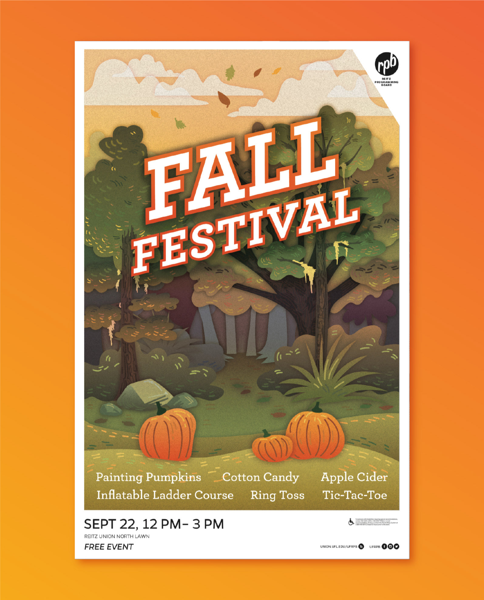
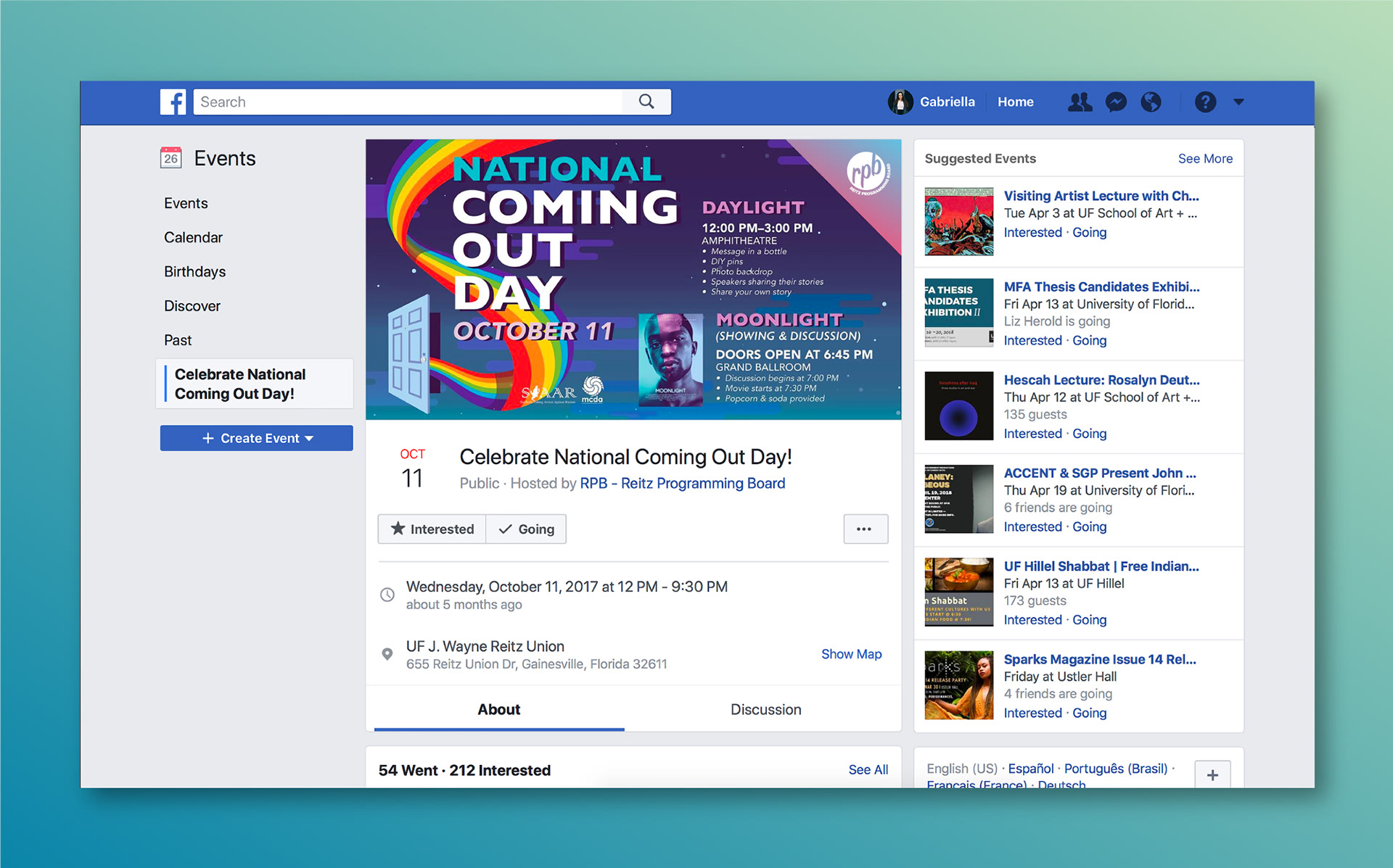
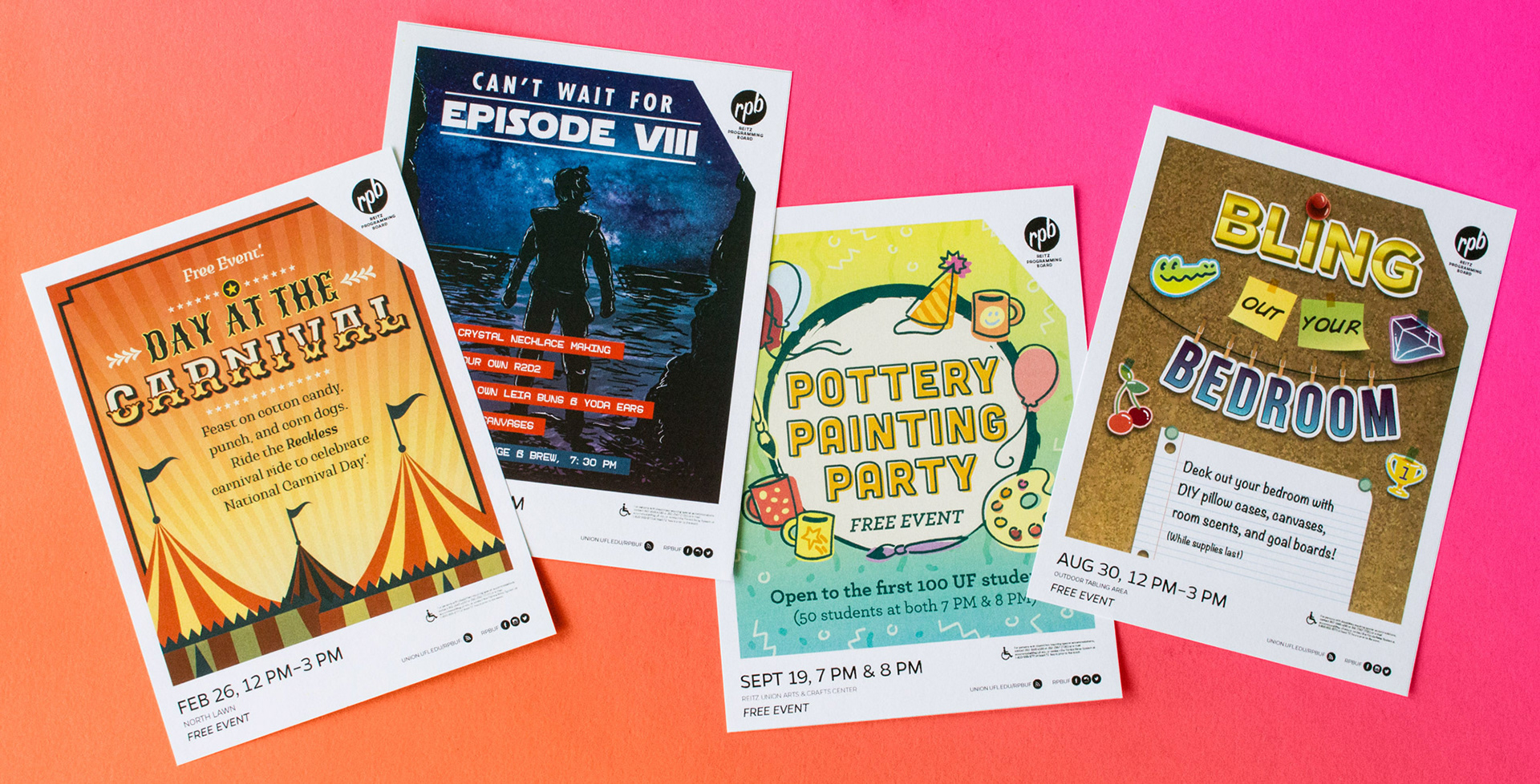
As part of my responsibilities as a J. Wayne Reitz Union Marketing Graphic Designer, I created graphics for multiple REITZ PROGRAMMING BOARD events. Each event required graphics for Facebook event covers, digital displays (to be shown on screens across the student union), website banners, posters, and handbills. This represents the buildout of the continuously distinct RPB brand.
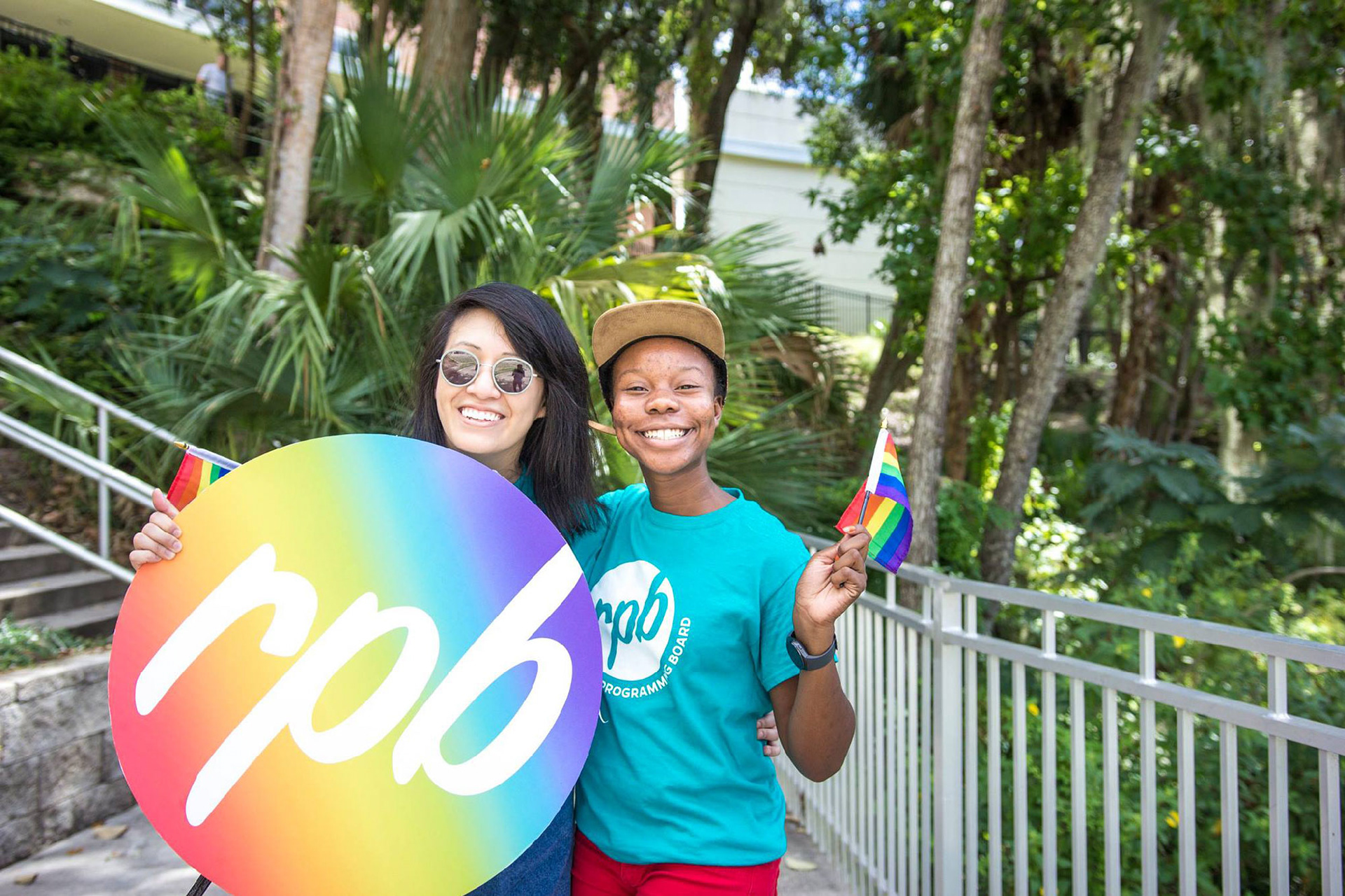
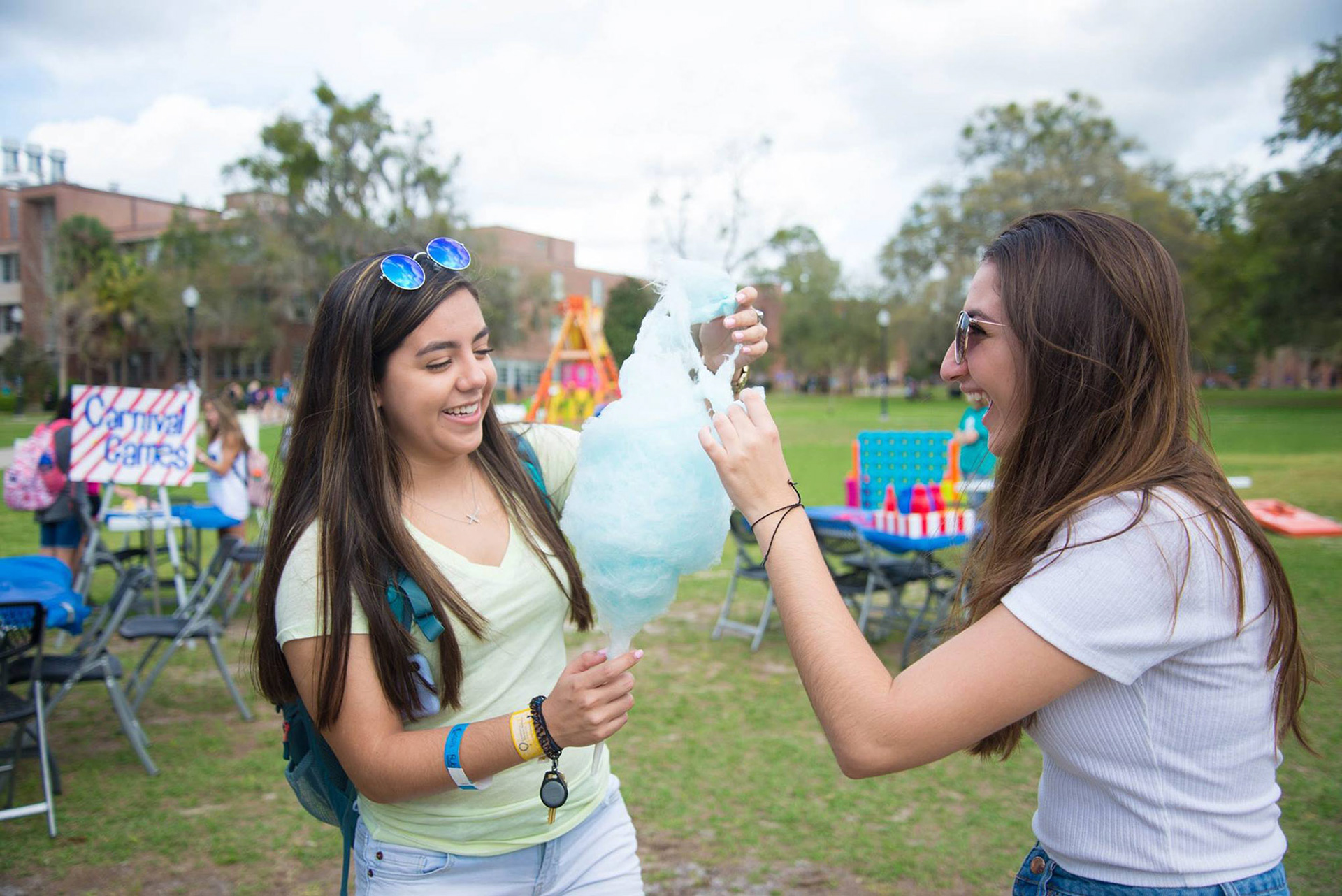
RPB “National Coming Out Day” (Photo Credit to @RPBUF on Facebook) and “Day at the Carnival Events” (Photo Credit to Isabella Guttuso)

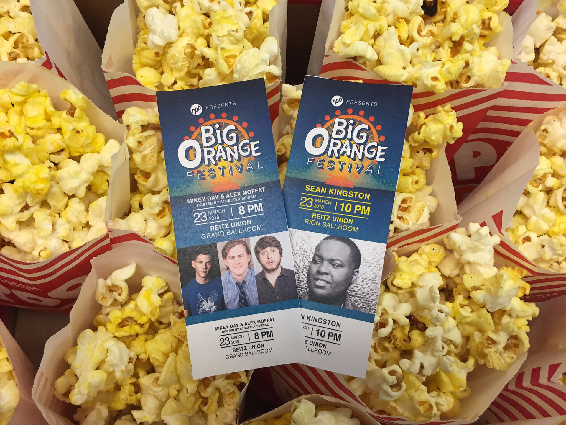
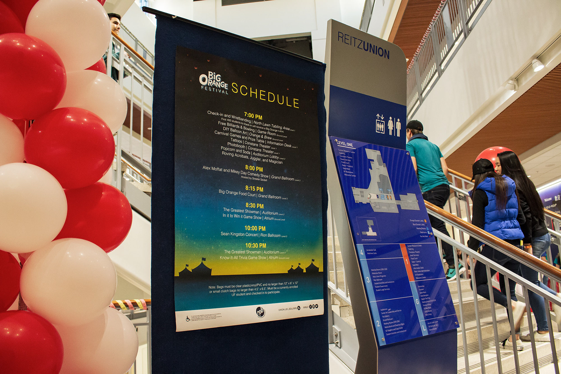
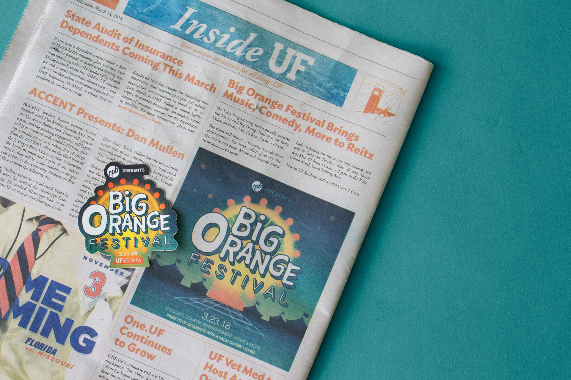
BIG ORANGE FESTIVAL
The largest event hosted by the REITZ PROGRAMMING BOARD is the Big Orange Festival, a free event featuring performances from musicians and comedians along with activities for students to enjoy. This year for the 5th annual festival, RPB asked that the brand be inspired from 80s–90s styles and feature carnival elements. Graphic materials created for this event included stickers, posters, badges, social media banners, lawn signage, tickets, PowerPoint templates, and shirts.
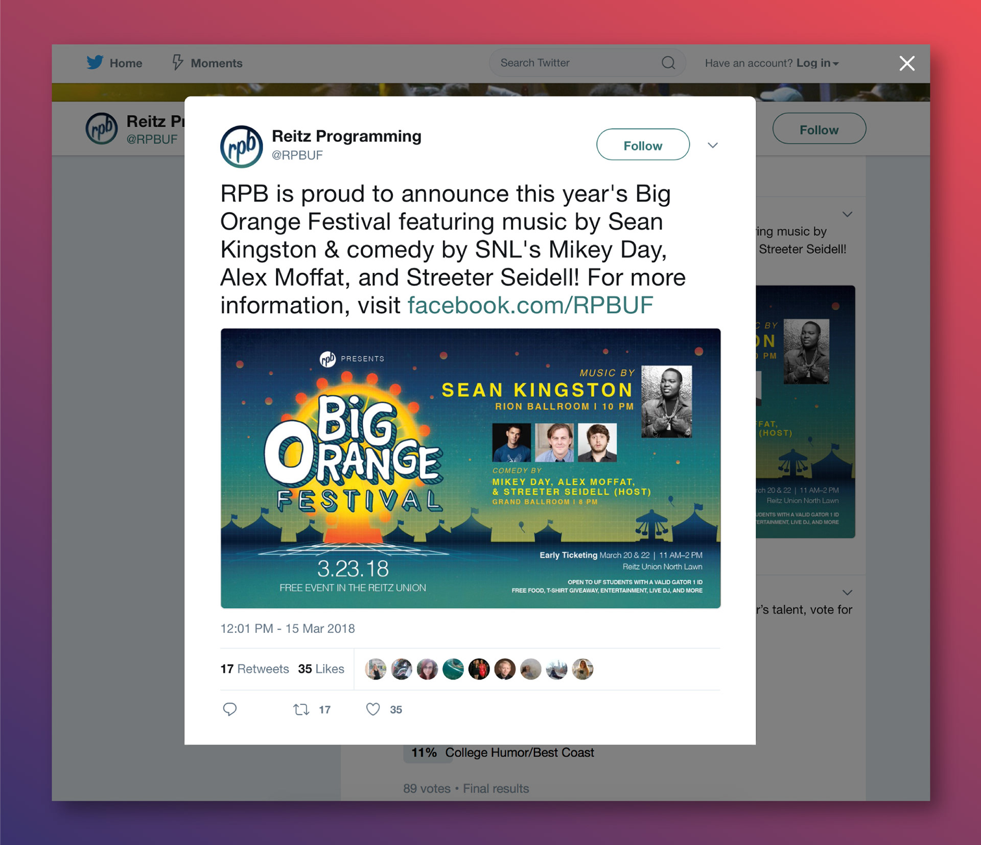
Big Orange Festival Screenshot and Image (Photo Credit to @RPBUF on Twitter)
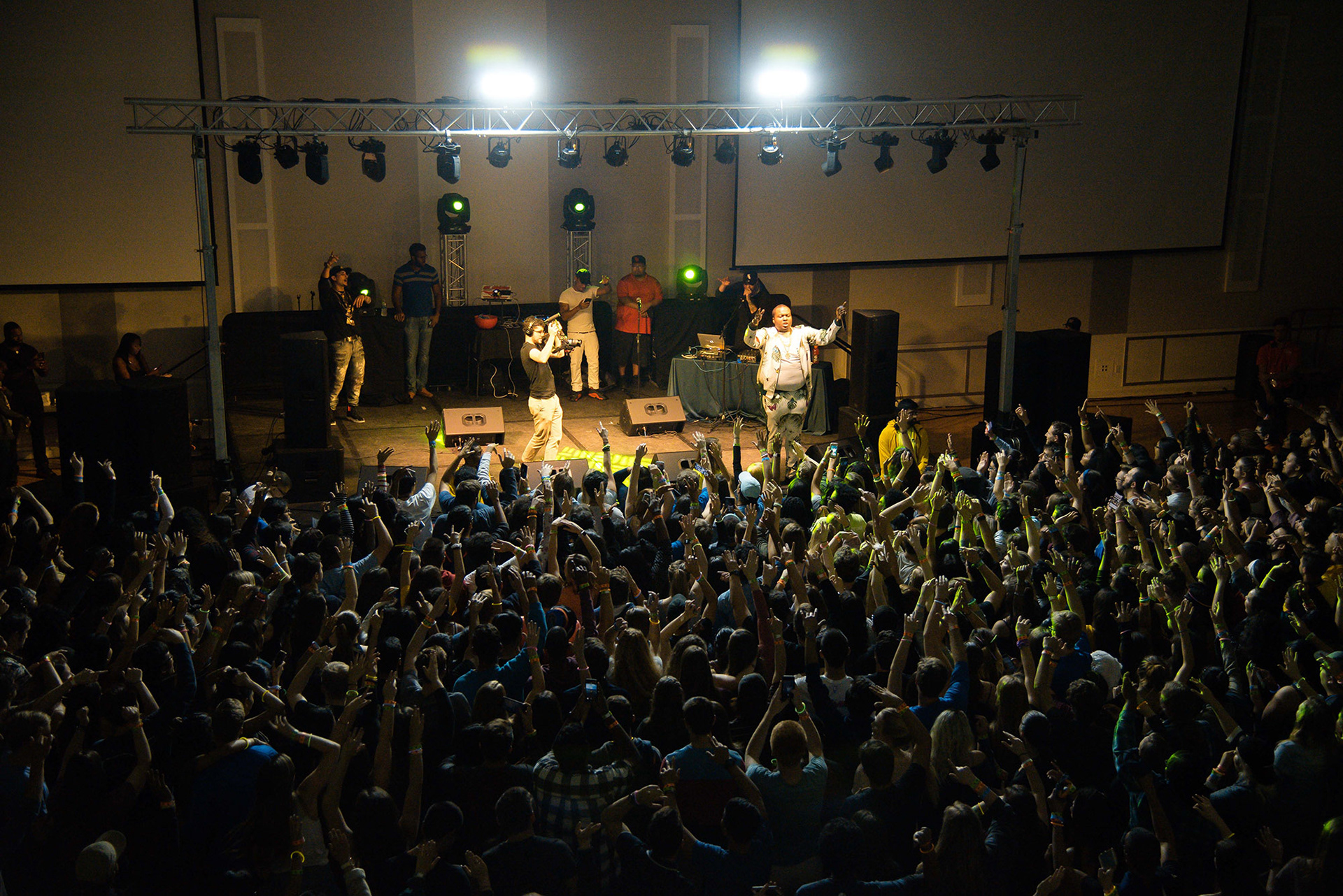
Sean Kingston Concert at the Big Orange Festival (Photo Credit to Isabella Guttuso)
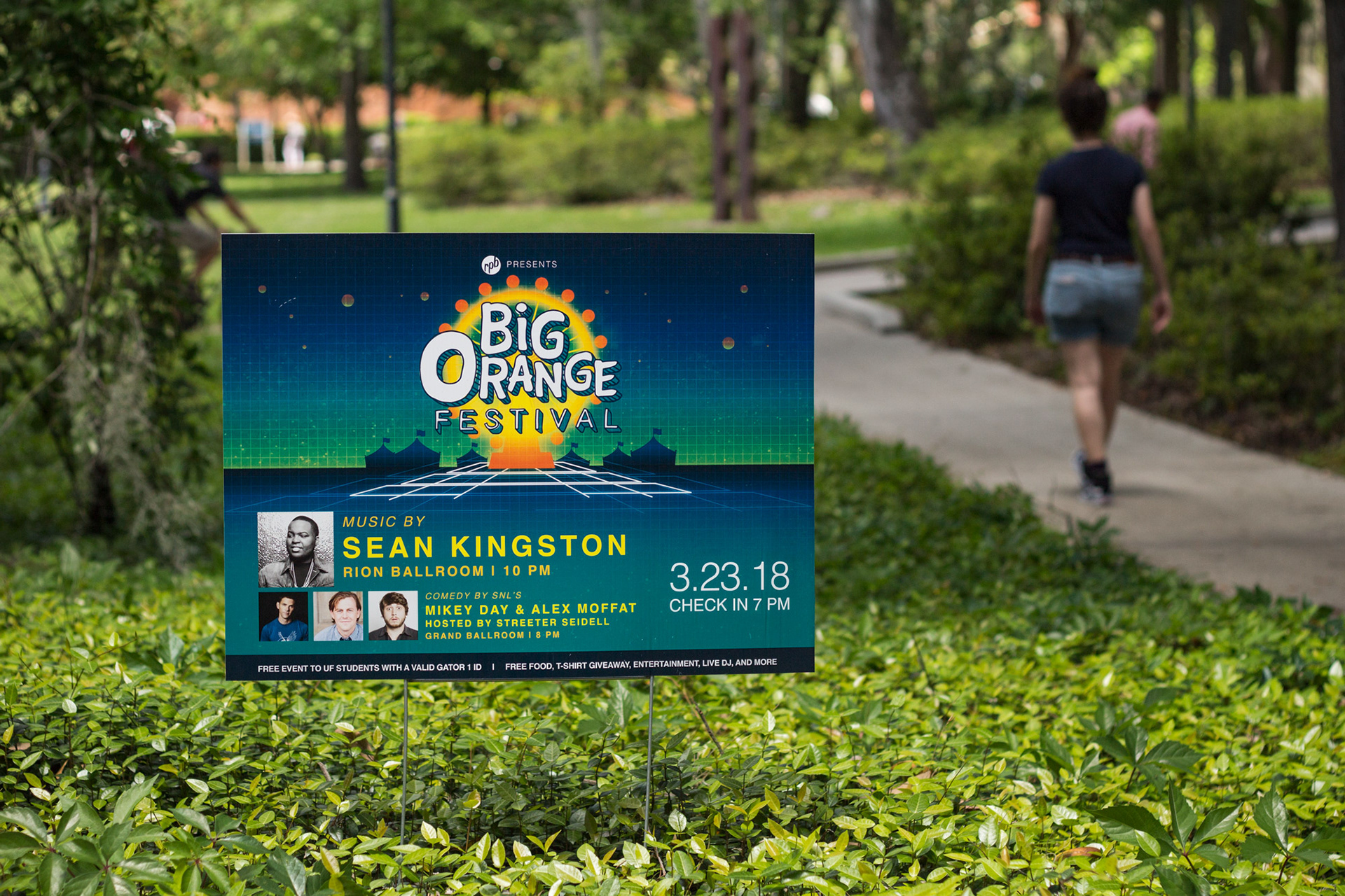
Lawn Signage (Photo Credit to Emily Tran)
