For her book release and musical campaign, EMPOWER, Lady Gaga is pushing for the empowerment of LGBT+ youth. Homophobic school and home life across the nation is discouraging and destroying kids and teens who feel they do not fit within a straight cisgender identity as they are raised to believe. With this campaign and book release, Lady Gaga will stand in the face of adversity and not only validate LGBT+ youth but open the minds of those closed off to understanding these identities.
(Photo and Production Credit to Emily Tran)
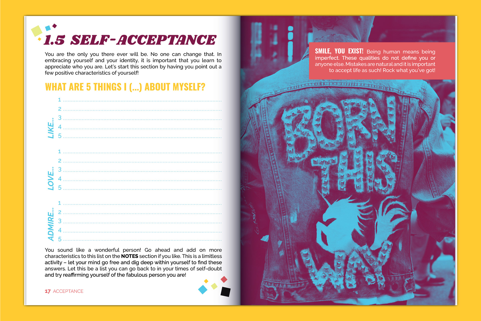
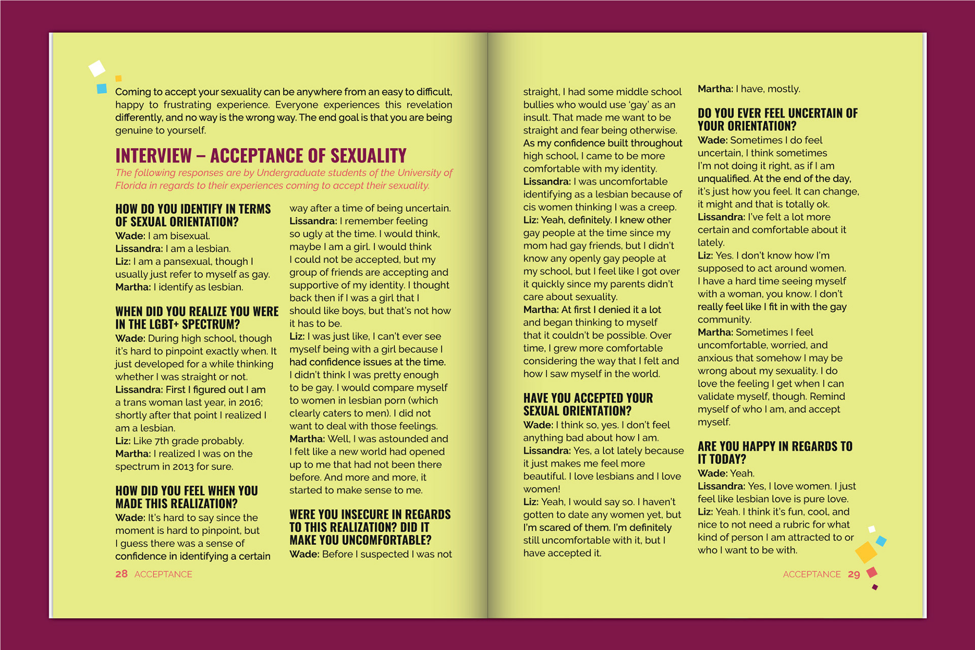
Book Component
VIP and Staff Badge Components
Shirt Design Component
INSPIRATION + SOLUTION
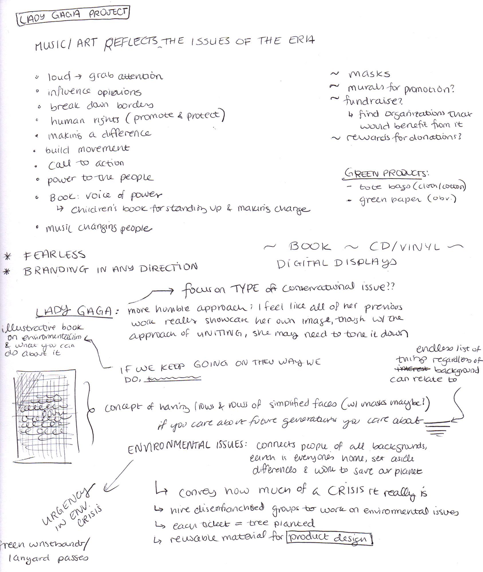
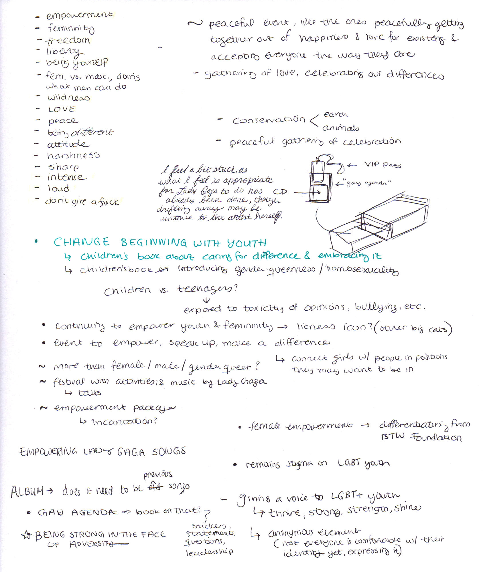
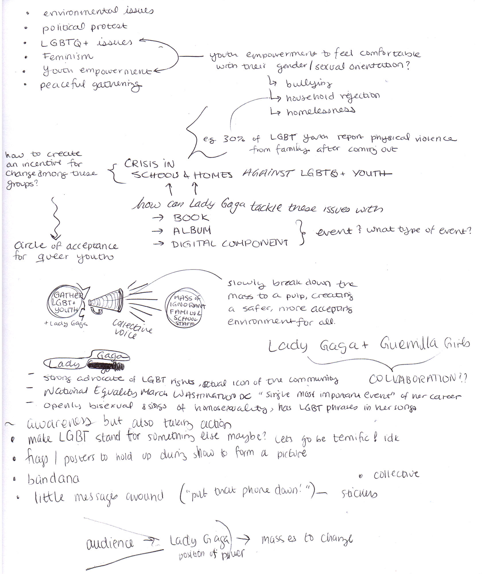
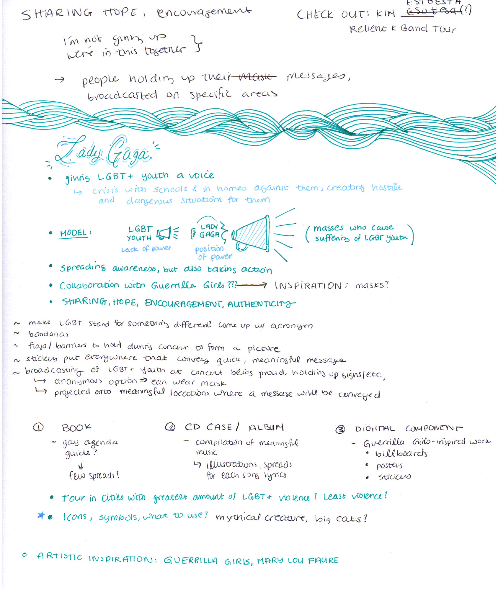
This class project challenged us to develop a musical campaign and book release based on our favorite artists, mine being Lady Gaga. As this artist identifies as queer and is considered to be an icon of the LGBT+ community, I chose to center Lady Gaga's campaign around empowering those in the community, specifically youth and teenagers. Lady Gaga could challenge gender norms and heteronormativity and bring comfort to the community with her campaign. With her loving and fearless personality, she has the power to take a risk and encourage America to become open-minded and accepting of gays, lesbians, bisexuals, and everyone else in the LGBT+ community.
With the EMPOWER campaign (the strongest word that conveys what the campaign would achieve), Lady Gaga would tour cities all across the United States that ranked lowest in the HUMAN RIGHTS CAMPAIGN MUNICIPAL EQUALITY INDEX (which rated how gay-friendly a city may be based on LGBT+ legislation and services available). As part of this tour, users may go on the EMPOWER website under the “PROJECT YOUR EXPERIENCE” section and write a brief statement of their experience as queer-identifying people. A projected screen onto the toured cities' town halls would display each of these approved statements as means to directly get the message of reform to these areas.
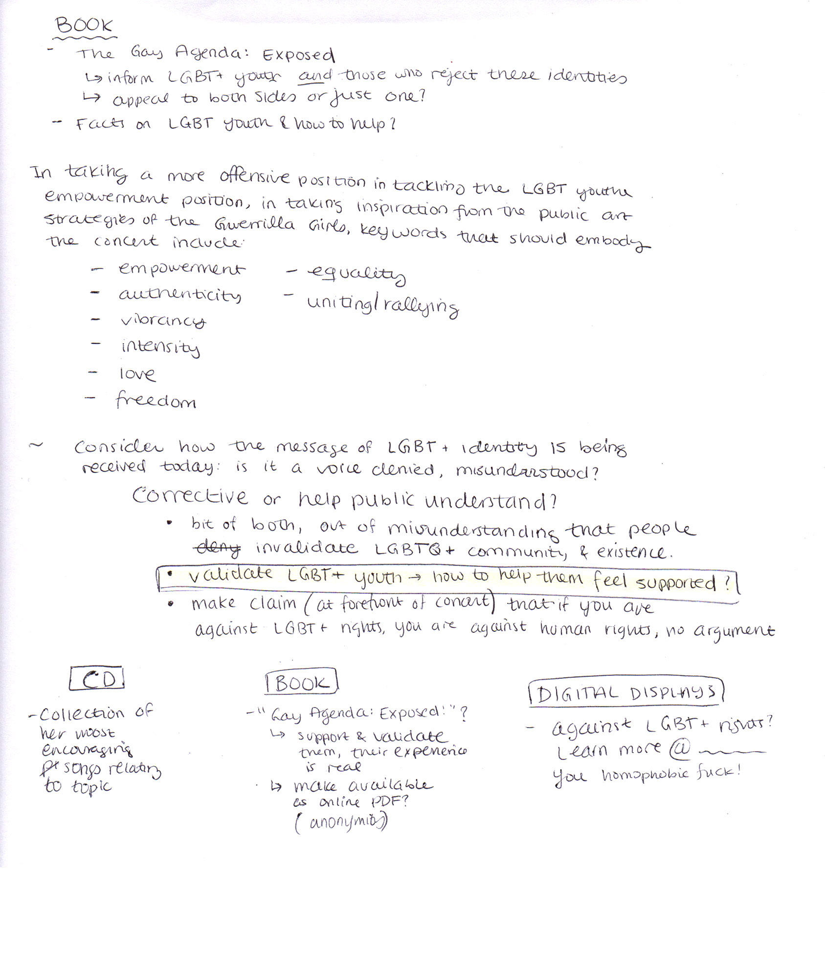
The book release, titled “The Gay Agenda”, is an interactive book targeted towards queer youth and teens to express their gender and orientation and learn about the community. The objective of this book is to help these users feel comfortable and validated with their identities.
VISUAL SYSTEM
Key words for the branding included individuality, vibrancy, intensity, love, freedom, equality, and unity. The visual direction of this project is centered around the usage of the holographic paper texture. The holographic paper is used as its multiple facets reflect all colors of the rainbow. This is symbolic of the diverse spectrum of sexuality and of the rainbow flag itself. The palette of the project is inspired by this texture—it is a subtle reinterpretation of the rainbow flag colors. The project takes on a more simple, minimalist design style in order to balance the complex holographic pattern. The photography selected exude an emotional impact to audiences and features the gradient map effect with colors from the branding palette. The narrow and thick Oswald font helps convey a stricter, more serious tone to the messages translated in EMPOWER. The Raleway font has a friendly, circular appearance that balances out the Shrikhand font.
THESE GRAPHICS DO NOT BELONG TO ME. The imagery above has been used as a broad-level source of graphic inspiration for this class project only. All material created for the EMPOWER project will be original in graphic design, subject material, and copywriting. These graphics are not to be shared or redistributed.
Final typography and palette utilized for the EMPOWER visual system.
Holographic sticker paper was used to feature the texture on the physical items of the project. I used the Silhouette Studio Cameo to die cut the sticker paper, then stuck the holographic texture onto paper used for the book and badge components.